Finger Print Scanner In Apps Ux Design

Touch ID UX for iOS app
by knowing how things work under the hood
![]()
It is not a problem for an iOS developer to find an article describing the LocalAuthentication framework usage. The framework provides an API around Touch ID, a fingerprint identity sensor found in latest iPhone's and iPad's.
While the API is rather simple, there is an extra-work that needs to be done to make this actually useful for users within your app. Being a developer, I'd like to describe the behaviour of the system to help UI/UX experts to create user experience (UX) when it comes to biometric security.

Does your app need Touch ID support?
First of all — let's define the problem Touch ID aims to solve. Many apps do sensitive things related to particular user (payments, for example). It is essential for these apps to make sure that it is exactly that user who initiated that things to happen. Usually, this assurance comes from gathering the information only the particular user knows and comparing it with the information that was entered before (presumably, by this user), say, during the registration flow. Password is a common form of this secret information — user has to type his password before doing sensitive things on his behalf.
Typing is boring and time-wasting, right? Thus, apps usually save the password into a secure storage once, and then use it whenever needed without requiring user to enter it each time. However, in this case, there is no guarantee that each sensitive action is done by that user.
While many apps "keep it simple", there are a bunch of other apps around that takes this seriously. You can recognize them, for example, by a login form being presented each time you launch the app from scratch or after some threshold period has passed.
A simple, but yet prominent idea arises: wouldn't it be cool to always be confident about the person originating the action of gathering the password from a secure storage? (again, password is just an example here)
The idea behind Touch ID is to associate user's biometrics with an information only user knows and substitute typing with just a gentle single touch of the his finger.
Behind the scene, iOS compares biometric information and if it matches, returns to our application the secret information stored in a secure storage. So on success, our app has the password (or something else) to authorise user's action.
Use Touch ID in an app, if often it requires to authorize user's action by asking him to type something only he knows. Touch ID would streamline the process while still keeping the same level of security.
Now, when we have an idea of where our app could leverage biometrics sensor, let's discuss few UX aspects of its integration.
Touch ID is an optional *iOS* feature

Touch ID and its usage are both optional for users. Not all devices have Touch ID hardware (the list) and users have to opt-in to Touch ID for the whole system by going through the process of setting it up via Settings application. The availability of the sensor starts when user turns Passcode ON and adds at least one finger to the Fingerprints list. This leads to the obvious UX conclusion:
Application's User Interface (UI) related to Touch ID should be able to become conditionally hidden/shown. Developers can make a logic to detect the availability.
Touch ID is an optional *app* feature

Even if everything is ready to use Touch ID on the system level, the usage within the app should be still optional and clear:
The application has to make it clear what is associated with the fingerprints. The association also should be optional — somebody could just prefer typing rather then trusting the sensor.
Having a switch with "Use Touch ID" title on the screen where the user provides the information that needs to be secured — is just one option. However, avoid moving this switch to the Settings application — it is just not suited enough for such an important and dynamic functionality.
Also, once turned ON by user, this setting should not be turned OFF automatically by the app. The setting represents a willing of the user to use Touch ID—not the ability to do so successfully on the application's level.
Make a proposal to use Touch ID
Users tend to follow the same path while using apps. It is likely that many don't check the settings often. That's why, whenever the app can provide the Touch ID functionality to simplify sensitive actions —promote it to user and offer help.
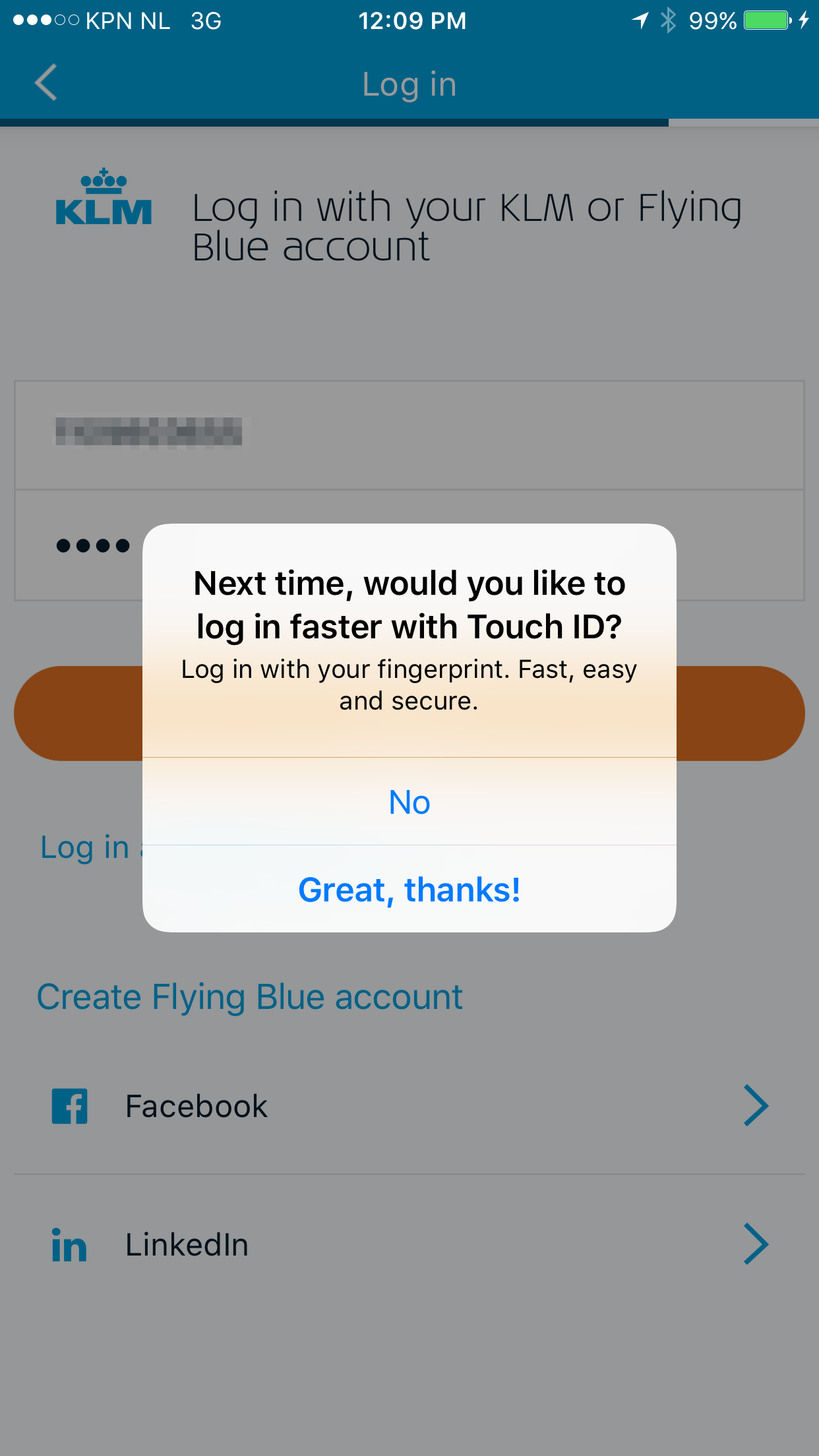
I love how KLM app does this. The app logs you out after a while automatically, so you have to log in back again. They recently incorporated Touch ID into this flow. Upon first successful login, the app prompted me to use Touch ID next time (I was excited to opt-in):


Touch ID prompt
Whenever the application requests system to capture biometrics, iOS presents an alert, which could (and should) be customized to some point.

Description subtitle. Being clear on what is associated with the fingerprints is important. Customize the description to let user know what would happen upon successful fingerprint capturing. For example, show the user's login he will be signed in with, as shown on the screenshot above.
Cancellation. Fingerprint request might be cancelled (either by the system of by the user) at the time it is presented. After that the alert is dismissed and the application is notified about the cancelation.
From the UX perspective, what should happen at the cancellation has to be defined. The answer differs between cases — you can do nothing or do something.
Fallback. After at least one failed attempt to capture a fingerprint, the fallback button would be shown in the Touch ID dialog. The title of that button could be customized by the app. When pressed, application knows that this option was chosen. Provide respective fallback button title and behaviour. See the screenshot below.

Failure. Eventually after several attempts to capture fingerprint the system might give up. The application receives the failure status in this case. This status has to be processed respectively.
Success. Upon success fingerprint scanning, the application would be given a green light to obtain secret info from the secure storage. Keep in mind, though, that it could become obsolete anytime. Thus, even, when capturing biometrics went OK, the authorization could fail. Provide a UI to re-enter the secure information upon such a failure. It should then be associated with Touch ID again, so the next time the flow could succeed.
I would recommend to take a look at iTunesConnect iOS app. It is as a good example of Touch ID usage.
What About Face ID?
From UI/UX and development perspectives, since Face ID introduction not many things have changed. All of the points discussed in this post are still applicable for Face ID (I even started to add similar UX examples of Face ID usage along with Touch ID cases).
However, developers can detect whether the type of sensor is Touch ID or Face ID. This helps to present different prompts to users, based on the result of the check.


Conclusion
Touch ID is still a controversial feature for both, apps makers and apps users. What can explain such a low adoption of it across the apps around? Perhaps, partially, it is a privacy concern. Or, maybe there is a lack of understanding how it works and, consequently, difficulties in developing cases for its use. I hope, this post shed some light on the subject and would help someone.
UPDATE Feb, 21, 2017: Few small corrections and new "Make a proposal to use Touch ID" section with KLM app example.
UPDATE Nov, 12, 2017: Section about Face ID is added to highlight the specifics.
UPDATE Nov, 24, 2017: "Read More" footnote is added.
UPDATE Mar, 20, 2018: As I've recently become a happy owner of iPhone X, I started to update the post to provide examples of Face ID usage along with Touch ID cases.
Finger Print Scanner In Apps Ux Design
Source: https://medium.com/@yevhendubinin/touch-id-ux-for-ios-app-efe4de3bc245
Posted by: burkethentom.blogspot.com

0 Response to "Finger Print Scanner In Apps Ux Design"
Post a Comment